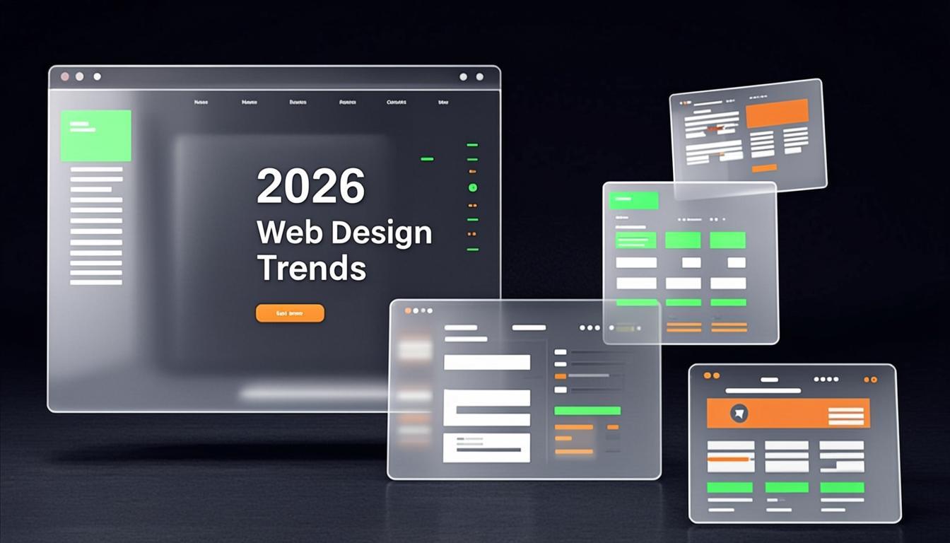
Web design moves fast. What felt cutting-edge two years ago can look tired today. But chasing every new trend is a trap — the best designs in 2026 aren't those that adopt everything, but those that adopt the right things thoughtfully. Here are the nine design trends our creative team is most excited about, along with practical guidance on how to implement them without your site looking like a trend report by next December.
1. AI-Generated Design Elements
AI has moved from a novelty to a legitimate design tool. In 2026, we're seeing AI used for generating custom illustrations, hero imagery, pattern backgrounds, and iconography — not entire layouts, but specific visual assets that would be expensive or time-consuming to create manually.
The key is using AI-generated elements as a starting point, not a final product. Raw AI output often has a distinctive "AI look" that savvy users can spot. The best implementations involve AI-generated assets that are then refined, color-corrected, and integrated into a cohesive design system. Tools like Midjourney, DALL-E, and custom-trained models are being used by our design team to create unique brand visuals that feel fresh without feeling robotic.
How to use it: Use AI for hero section illustrations, blog post headers, and decorative elements. Always refine the output. Never use AI-generated human faces for testimonial or team sections — authenticity matters.
2. Brutalist Design — But Refined
Brutalism in web design — characterized by raw, unpolished aesthetics, exposed grid structures, and unconventional layouts — is making a serious comeback. But the 2026 version is more intentional than the brutalism of five years ago. It's not about being ugly for the sake of being different; it's about stripping away decorative excess to focus on content and hierarchy.
Think monospace typography, high-contrast color combinations, visible borders, asymmetric grids, and typography-forward layouts. Brutalist elements work particularly well for creative agencies, tech startups, and brands that want to project confidence and authenticity.
How to use it: Don't go full brutalist. Instead, incorporate brutalist elements selectively — maybe a monospace accent font, visible grid lines in a section, or an asymmetric card layout — while maintaining overall usability. The contrast between brutalist elements and polished interactions is what makes it powerful.
3. Micro-Interactions and Scroll Animations
Static websites are dead. In 2026, users expect websites to respond to their actions with subtle, delightful feedback. Micro-interactions — small animations triggered by user actions like hovering, clicking, or scrolling — are what separate a good website from a memorable one.
This includes hover effects on buttons that feel tactile, scroll-triggered animations that reveal content progressively, parallax effects that add depth, and magnetic cursors that follow user intent. Libraries like Framer Motion and GSAP make these interactions smoother than ever, and modern browsers handle them efficiently without performance issues.
The critical rule: micro-interactions should enhance usability, not distract from it. Every animation should serve a purpose — guiding attention, confirming an action, or creating a moment of delight. If an animation slows the user down or makes the interface confusing, it's wrong.
How to use it: Add hover states to every interactive element. Use scroll-triggered reveals for content sections. Implement subtle loading animations. Keep individual animations under 300ms. Test on mobile — complex animations that work on desktop may feel janky on a phone.
4. Dark Mode as Default
Dark mode has been trending for years, but 2026 is the year it becomes the default starting point for many brands. With OLED screens dominating the market and users increasingly preferring dark interfaces (particularly in the 18-35 demographic), designing dark-first makes more sense than ever.
The new dark mode isn't just inverting colors. It involves carefully calibrated dark palettes with proper contrast ratios, thoughtful accent colors that pop against dark backgrounds, and subtle depth through layered surfaces. The best dark designs feel premium, immersive, and easy on the eyes — not washed out or hard to read.
How to use it: If your brand identity supports it, consider a dark-mode-first approach. Always provide a light mode toggle — accessibility requires respecting user preferences. Ensure WCAG AA contrast ratios (4.5:1 for body text). Test accent colors against dark backgrounds — some colors that work on white are illegible on dark surfaces.
5. Bento Grid Layouts
Inspired by the Japanese bento box, bento grid layouts organize content into a grid of distinct, differently-sized modules — each containing a self-contained piece of information or functionality. This trend has exploded thanks to Apple's product pages and is now everywhere.
Bento layouts work because they create visual variety within a structured system. Each cell can contain different content types — an image, a statistic, a testimonial, a feature description — while the overall grid maintains order and visual harmony. CSS Grid makes these layouts straightforward to implement and fully responsive.
How to use it: Use bento grids for feature showcases, service overviews, and product landing pages. Mix cell sizes for visual interest — 2x2 hero cells alongside 1x1 detail cells. Ensure each cell tells a complete story on its own. On mobile, stack the cells vertically in a logical content order.
6. 3D Elements Without Heavy Loading
Three-dimensional elements add depth and interactivity to web experiences, but historically they came with a heavy performance cost. In 2026, technologies like WebGL, Three.js, and CSS 3D transforms have matured to the point where 3D elements can be integrated without noticeably impacting page load times.
We're seeing 3D product viewers (particularly in e-commerce), interactive 3D illustrations, subtle depth effects in hero sections, and 3D icons. The trend is moving toward lightweight, purposeful 3D — not full 3D environments, but specific elements that benefit from spatial depth.
How to use it: Use 3D for product showcases, interactive data visualizations, and hero section accents. Always provide a 2D fallback for low-powered devices. Lazy-load 3D elements so they don't block initial page render. Keep polygon counts low and use efficient compression formats like glTF.
7. Typography-First Design
In a world of AI-generated images and stock photography, typography has become the most distinctive design element a brand can own. Typography-first design strips away visual clutter and lets type do the heavy lifting — through size contrast, weight variation, creative layouts, and expressive font choices.
This trend manifests as oversized headlines that dominate viewports, mixed font families that create visual tension, editorial-style text layouts, and kinetic typography in hero sections. Variable fonts have made this more feasible than ever — a single font file can now provide multiple weights, widths, and styles, reducing load times while expanding creative possibilities.
How to use it: Invest in a distinctive display font for headlines. Use dramatic size contrast — a 96px headline next to 16px body text. Mix serif and sans-serif fonts for editorial feel. Ensure readability is never sacrificed for aesthetics. Test on all screen sizes — dramatic typography can break on mobile if not properly responsive.
8. Sustainability-Conscious Design
As environmental awareness grows, sustainability is becoming a design consideration, not just a brand value. Sustainable web design focuses on reducing the carbon footprint of websites through lightweight pages, optimized images, minimal JavaScript, efficient hosting, and green energy-powered servers.
Practically, this means smaller page sizes (aiming under 1MB for most pages), lazy-loaded images and scripts, system font stacks where brand fonts aren't essential, SVG instead of raster graphics for icons and illustrations, and choosing hosting providers that use renewable energy. It's not just good ethics — lighter pages load faster, rank better on search engines, and provide better user experiences.
How to use it: Audit your page weights regularly. Compress all images to WebP or AVIF format. Remove unused JavaScript and CSS. Consider a green hosting provider like GreenGeeks or Google Cloud (carbon-neutral). These practices aren't just sustainable — they're better for performance, SEO, and conversion rates.
9. Inclusive and Accessible Design
Accessibility is no longer optional or an afterthought — it's becoming a core design principle that defines quality. In 2026, the best websites are those designed from the ground up to be usable by everyone, regardless of ability, device, or connection speed.
This includes proper semantic HTML, ARIA labels, keyboard navigation support, sufficient color contrast, text resizing compatibility, screen reader optimization, and reduced-motion preferences for users who experience motion sensitivity. It also extends to cognitive accessibility — clear language, consistent navigation patterns, and forgiving error handling in forms.
Accessibility also means designing for slower connections and lower-end devices. A beautiful design that only works on a fast connection in a major metro is a failed design for a user on a slower rural connection.
How to use it: Follow WCAG 2.1 AA standards as a baseline. Test with screen readers (VoiceOver, NVDA). Check contrast ratios with tools like Stark or WebAIM. Support keyboard-only navigation. Implement prefers-reduced-motion media queries. Optimize for 3G connections — a significant portion of your potential audience may not have fiber broadband.
How to Adopt Trends Without Looking Dated
Here's the paradox of design trends: the moment you chase them, you're already behind. The brands with the most enduring web designs aren't those that adopt every trend — they're those that have a clear design system and selectively integrate trends that genuinely serve their users and brand identity.
Our framework at Infinity Binary is simple:
- Start with your brand. Trends should enhance your brand, not override it. If brutalist design doesn't fit your brand personality, don't use it — no matter how popular it is
- Adopt 2-3 trends maximum. Pick the ones that align most naturally with your brand and audience. A dark mode + bento grid + micro-interactions combination is powerful. Dark mode + brutalism + 3D + typography-first + bento grid is chaos
- Always prioritize usability. If a trend makes your site harder to use, slower to load, or confusing to navigate, it's the wrong choice for your users
- Plan for longevity. Implement trends in ways that can be easily modified later. Don't build architectural decisions around a trend that might fade in 18 months
- Test with real users. What looks amazing in Figma might confuse actual customers. Always validate design decisions with user testing
Need a Website That Stands the Test of Time?
At Infinity Binary, we don't design for trends — we design for results. Our creative team combines aesthetic innovation with strategic thinking to build websites that look stunning, perform flawlessly, and convert visitors into customers. Whether you need a brand-new website or a redesign that brings your current site into 2026, let's talk about your project.